iPhone Color Picker
Update
This code now lives as iOS Color Picker on GitHub and is vastly improved. There is an example project showing how to use the color picker, also on GitHub.
Between two conferences, ASIC in Bend and CogSci in Portland, I’ve taken a brief detour into Seattle. In addition to walking around the city and putting the finishing touches on my talk for CogSci here’s the corresponding paper) I took it upon myself to make a super-simple iPhone app in the shortest amount of time possible. Without a lot of starting experience in iPhone development, it turns out that it took me about two days of mostly not working on it. But this post isn’t about that app; I’ll write about that in the near future when the app’s submitted to the App Store and I have some time to craft some “Marketspeak”. This post is about my adventures in crafting a color-picker for the iPhone.
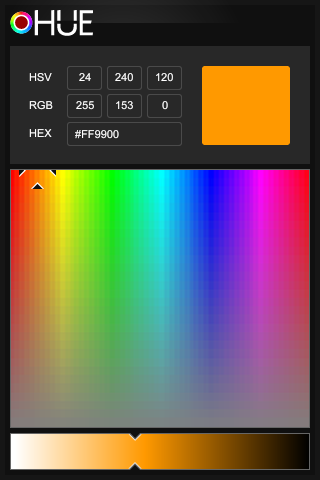
Apple wasn’t kind enough to include a system color-picker in iOS. And given the iPhone’s general bend against productivity that’s only fitting. Googling for iPhone color-picker code returns a bunch of options that amount to a few pre-defined color swatches on buttons to give your users a choice from among five whole colors!!! There is, however, one color-picker that looked promising from Vevent. It’s a fantastic starting point, but they got a few things totally wrong.

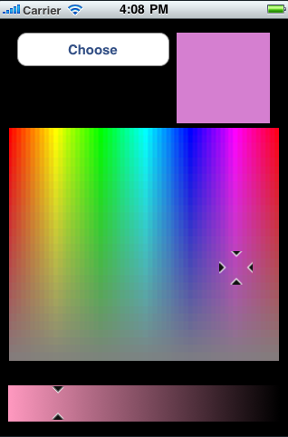
Two minor, one major, and one pedagogical issue to be fixed:My first minor issue with it as a generic color-picker is that there’s no room left in the user interface to actually choose the color the user selected! It’s a pretty simple oversight that seems to come from the fact that this mini-app was built as a designer’s tool. I’m guessing that as a designer (and I’m not one) you have to just look at the color, and then get the hex or RGB codes for it. In that original app, there’s no need to actually select a color. But a user (not a designer) selecting an arbitrary color probably couldn’t care less about what the color’s values are. So I repurposed that space on the screen for a button to choose the current color.
The second minor issue is that the brightness bar is too close to the hue/saturation color field. When you push the crosshairs down into unsaturated regions of colorspace, you’re liable to make the brightness slider jump to somewhere you didn’t want it to go.
The major issue with this color selector is that the brightness bar is flat-out wrong. While it’s true that minimum brightness for any hue/saturation pair is black, it is not true that maximum brightness is always white! The internal logic of the code reflects this, but its outward appearance is misleading.
And the pedagogical issue? For a developer just starting out on the iPhone, the sample app doesn’t actually show you how to use its code as a drop-in color picker. There’s no delegate interface, and hence no delegate methods, for getting the color that’s selected. As I already mentioned, there’s no way to even choose a color. You just push around the crosshair and sliders and watch the pretty numbers and colors go by. In other words, it’s not a drop-in solution when it easily could have been.
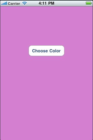
So I fixed it. The new sample project opens with a plain colored background and a button that lets you choose a color. Pressing the color slides in the new color-picker as a modal view with the first view’s controller as its delegate. Pressing the “Choose” button puts away the picker, and tells the initial view which color was chosen. That gets assigned to a key in user preferences so that the selected background color persists.

